

What Colour Bedding Makes a Room Look Bigger? A Practical Guide
The whitest bedding isn’t always what makes a bedroom feel more spacious. If your room feels cramped, dim or visually busy, choosing what colour bedding makes a room look bigger is a useful place to start. The key is to consider contrast and continuity as well as brightness.
Light shades can help a room feel open, while bedding close in tone to the walls can soften visual boundaries. You don’t have to choose stark white: warm creams, soft neutrals and muted colours can add depth without overwhelming a compact room.
This guide explains how colour, pattern and light work together, then takes you through choosing a palette for your walls, flooring and furnishings. You’ll also find practical ways to use texture and layering for a calm, polished finish. The result is a more cohesive bedroom, with comfortable bedding that complements the space rather than competing with it.
Key Takeaways
- For what colour bedding makes a room look bigger, begin with pale, softly toned shades and consider how the rest of the room affects the overall impression.
- View bedding colours in daylight and under your usual lamps, as lighting can change how warm or cool a fabric appears.
- White isn’t essential: pale neutrals and muted colours can also feel spacious, while deeper shades create more emphasis.
- Build your palette around the room’s light and fixed finishes, then add one or two complementary tones.
- Choose bedding that suits your comfort and upkeep preferences as well as the room’s visual character.
What colour bedding makes a room look bigger? Start with visual space
If you’re asking what colour bedding makes a room look bigger, start with pale, softly toned shades. Warm white, ivory, pale grey, soft beige and muted pastels can help a bedroom feel lighter and more open, especially when they work with the room’s existing colours. No single shade is a guaranteed fix: daylight, wall colour, flooring and the size and placement of furnishings all affect the overall impression.
Bedding colour can make a bedroom feel more spacious by creating a lighter, more continuous visual scheme, but it can’t change the room’s actual dimensions. Colour is a powerful design tool because it affects how we perceive a space. The goal isn’t necessarily to make every surface match, but to avoid unnecessary visual breaks that can make a compact room feel crowded.
For a useful overview of how colour choices contribute to interior design, watch this video:
Which light bedding colours create an airy impression?
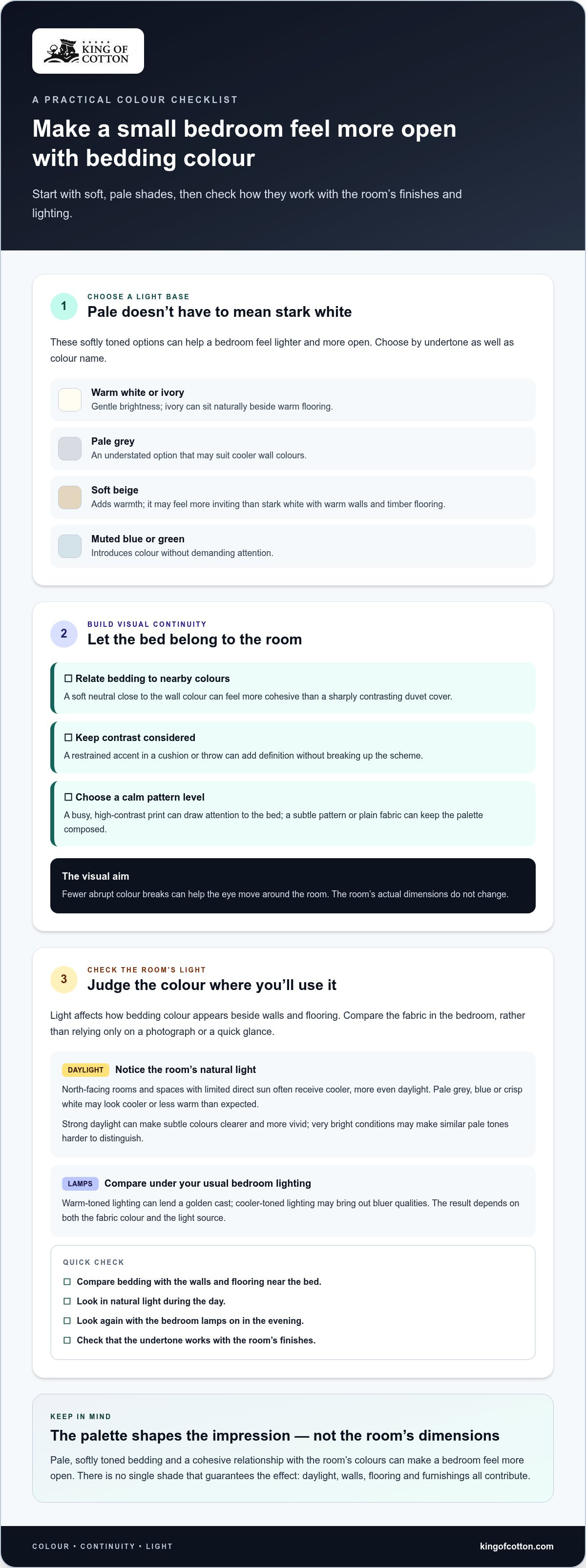
Warm white and ivory add gentle brightness; pale grey feels understated, while soft beige brings warmth. Muted pastels, such as delicate blue or green, introduce colour without demanding attention. Consider undertones as well as the shade: ivory may sit naturally beside warm flooring, whereas cool pale grey may work better with cooler wall colours. Compare the bedding with these finishes instead of choosing a colour in isolation.
If you’re refreshing the bed, explore bedroom linen in a colour and finish that suits your scheme. Cotton, Egyptian cotton, Percale and Sateen offer different fabric choices to consider alongside colour. The effect on perceived space comes from the palette, not the fabric type.
Why can visual continuity make a bedroom feel more spacious?
When bedding and nearby surfaces have a similar visual weight, the eye can move around the room with fewer abrupt stops. For example, bedding in a soft neutral close to the wall colour may feel more cohesive than a sharply contrasting duvet cover that draws immediate attention to the bed. You don’t need to avoid contrast altogether: a restrained accent in a cushion or throw can add definition without breaking up the scheme.
Think of the bed as part of the room’s overall composition. A bold block of colour or a busy pattern can make it the dominant focal point, while a calmer palette can help the space feel settled. This is about the impression of openness, not gaining floor area: the room stays the same size, but its balance of colour and contrast may make it feel less crowded.
How natural and artificial light change bedding colour
The same bedding can look warm in one bedroom and cooler or brighter in another. Window direction, the strength of daylight and the lamps you use all affect how fabric colour appears beside your walls and flooring. This matters when choosing what colour bedding makes a room look bigger: a shade that looks light in a shop may look different at home.
Lighting doesn’t change the bedding itself, but it changes how its colour is perceived. The relationship between light, colour and the perception of interior spaces is why it’s worth judging a palette in the room where you’ll use it, rather than relying on a photograph or a quick glance.
How does daylight affect pale and cool bedding shades?
North-facing rooms and spaces with limited direct sun often receive cooler, more even daylight. Pale grey, blue or crisp white bedding may therefore appear cooler or less warm than expected. Strong daylight, by contrast, can make subtle colours look clearer and more vivid, though very bright conditions may make similar pale tones harder to distinguish. These are normal effects of light interacting with colour.
Compare the bedding colour with your walls and flooring in the bedroom, ideally near the bed. Check whether its undertone works with the room’s daylight instead of choosing by colour name alone.
What should you check under bedroom lighting?
Look at the colour under the lamps you regularly use as well as in daylight. Warm-toned lighting can lend a golden cast, while cooler-toned lighting may bring out bluer qualities. The result depends on both the fabric colour and the light source, so there’s no universal rule that one type of lamp will suit every shade. Compare the colour with nearby finishes before choosing your bedding.
For a practical comparison, look at the colour at different points in your usual routine: in natural light during the day and with the bedroom lamps on in the evening. This shows whether a pale neutral stays gentle, a muted colour feels unexpectedly cool, or two similar shades blend as intended. If the bedding will sit beside a painted wall, compare them together rather than judging each colour separately.
Once you’ve found a shade that feels composed in both lighting conditions, consider whether its fabric and finish suit your preferences too. Explore bedroom linen as you refine the palette, and assess your chosen colour in the light where you’ll rest.
Do small bedrooms have to use white bedding?
No. White is one option, not a requirement. Pale shades can help a room feel lighter, but the right choice depends on its daylight, existing décor and the atmosphere you want. A room with warm walls and timber flooring, for example, may feel more inviting with soft beige than stark white. Colour influences how we perceive a space, as ArchDaily explains in its guide to how colours change space perception.
Consider the bedding as part of the whole scheme. Strong contrast can make the bed stand out as a large block, while a calmer relationship between bedding, walls and nearby furnishings can feel more cohesive. Pattern matters too: a busy, high-contrast print may draw attention, whereas a subtle pattern or plain fabric can keep the palette composed. These are ways to guide the eye, not strict rules about what a small room can contain.
When do pale neutrals work best?
Pale bedding is a useful starting point if the bedroom feels dim or visually busy. Warm whites, ivory and soft neutrals can add brightness without the sharper effect of stark white. Choose an undertone that works with your walls and flooring, then add interest through fabric and finish rather than relying on a strong print. Explore the bed linen collection to consider colours and fabrics for your scheme.
Can darker bedding still work in a small bedroom?
Yes. Deeper shades can bring richness and depth, especially when the room has enough light or the rest of the palette provides balance. Try pairing dark bedding with lighter walls, or echo its colour in a small, considered accent elsewhere. Keep competing patterns to a minimum so the bed feels intentional rather than visually crowded. Your preferred mood matters too: a restful, cocooning feel may be more important than making the room seem as bright as possible.
Use this comparison as a starting point, then judge each option against your own finishes and lighting:
| Colour approach | May suit a room that… | To keep the look balanced |
|---|---|---|
| Pale neutrals | Feels dim or has several competing details | Choose a warm or cool undertone that works with the walls and floor |
| Muted colours | Needs personality without a bold focal point | Repeat the tone subtly elsewhere in the scheme |
| Deeper shades | Would benefit from a richer, more intimate mood | Balance with lighter surroundings and limit busy patterns |
So, what colour bedding makes a room look bigger? Pale colours can help, but a cohesive palette is more useful than a blanket rule to choose white. Select a shade that works with the room’s light and finishes, then make it your own.
How to choose bedding colours for your room, step by step
A considered palette starts with the room you have, not an isolated colour chart. If you’re deciding what colour bedding makes a room look bigger, use this sequence to choose a shade that sits calmly alongside your existing finishes and furnishings.
- Observe the light. Notice how the bedroom looks in daylight and with its usual lamps on. Decide whether the overall feel is warm, cool, bright or subdued.
- Note the fixed finishes. Look at wall colour, flooring and any larger furnishings or curtains you plan to keep. These are the anchors for your palette.
- Choose a base shade. Select a light or mid-tone that works with those finishes. A soft neutral provides a quiet foundation, while a muted colour adds gentle character.
- Introduce one or two complementary tones. Use a secondary shade in pillowcases, a duvet cover or a bedspread. Repeating a tone helps the bed feel connected to the room rather than visually separate.
- Review the whole combination. Compare your chosen colours with the curtains and nearby furnishings. If the palette feels fragmented, remove a competing shade or pattern before adding anything else.
How do you build a calm bedding palette?
Begin with a light or mid-tone base that suits the room’s existing colour temperature. Add a secondary colour through one or two bedding elements, then create interest through texture and finish rather than continually introducing new shades. For instance, tonal pillowcases can add subtle variation to a plain duvet cover while keeping the overall scheme composed.
Fabric is another part of the decision. Cotton, Egyptian cotton, Percale and Sateen offer different options to consider for comfort and finish. The palette is what ties the room together.
How should you use pattern and contrast?
Large, high-contrast patterns can make the bed a strong focal point, which may suit a room with otherwise simple décor. If the bedroom already feels busy, quieter patterns or tonal designs bring detail without adding another competing feature. A single patterned element against plainer bedding is often an easier way to introduce personality than several bold prints at once.
For further guidance as you consider fabric and finish, read The Ultimate Guide to Buying Luxury Bed Linen. To put your palette into practice, explore the bedroom linen collection and look for colours that complement the finishes you’re keeping.
Complete the spacious look with bedding that suits your bedroom
A spacious impression comes from a considered whole-room palette, not one supposedly perfect bedding colour. Choose shades that work with the bedroom’s light, walls and flooring, then keep the overall arrangement cohesive. This leaves room to express your taste without making the bed compete with every other detail.
Comfort and everyday practicality matter as much as visual effect. The answer to what colour bedding makes a room look bigger can guide your palette, but it shouldn’t mean choosing a shade you don’t enjoy or a set that doesn’t suit how you use your bedroom. Consider how the colour looks in your usual light, how it works with existing furnishings and whether the bedding suits your routine.
What fabric details matter after choosing a colour?
Once you’ve found a suitable shade, consider fabric and finish as separate, complementary choices. Cotton, Percale and Sateen are options to explore according to your preferred feel and everyday bedroom use. These fabric choices don’t change the room’s dimensions or replace the visual effect of colour; they help determine how you want your bedding to feel as part of a restful space.
Think about the experience you want from the bed, as well as the upkeep that fits your household. A colour can be visually harmonious, but it should also be pleasing to live with. Keeping colour and fabric decisions distinct makes it easier to create a bedroom that looks composed and feels comfortable.
How can you keep the final look balanced?
Repeat a chosen colour in just a few details, such as a cushion, throw or bedside accessory. This gentle echo can connect the bedding to the rest of the room without making every element match. If the bedroom already feels crowded, avoid adding several competing focal points. Let one considered detail provide interest while the rest of the scheme remains calm.
You don’t need to replace all your furnishings to refine the look. Begin with the bedding and see how it sits with the pieces you’re keeping. Make small adjustments only if the palette feels disjointed. The result can be polished without feeling over-styled.
For a considered finishing touch, explore premium bedroom linen in colours that complement your scheme, and choose a fabric and finish that make the room feel distinctly yours.
Create a bedroom that feels open and restful
The most effective answer to what colour bedding makes a room look bigger is a shade that works with the room’s light and existing finishes. Pale colours can create an airy impression, while muted or deeper tones can also feel balanced when you consider contrast and pattern. The aim is visual cohesion, not simply an all-white scheme.
Before settling on a palette, view colours in your bedroom at different times of day and alongside the furnishings you’re keeping. Then choose bedding for comfort and everyday use as well as appearance. Cotton, Egyptian cotton, Percale and Sateen offer different fabric options to consider as you refine the feel of the bed.
King of Cotton supplies premium bedroom linen to homes and hospitality businesses. Explore refined bedroom linen and choose a colour and fabric that complement your space.
Frequently Asked Questions
What colour bedding makes a small bedroom look bigger?
Pale neutrals such as warm white, ivory, soft beige and light grey can help a small bedroom feel brighter and more open. The best choice depends on the room’s natural and artificial light, as well as how the shade works with the walls and flooring. Compare colours in the bedroom itself before choosing. A tone that works with the existing finishes is often more effective than selecting a pale shade in isolation.
Does white bedding make a room look bigger?
White bedding can create a light, fresh impression, but it isn’t the only way to make a bedroom feel spacious. Ivory, pale grey and muted colours can also work well when they suit the room’s palette. Consider undertones and lighting: bright white may feel stark against warm finishes, while a softer white can blend more gently. Check the shade in daylight and under your usual bedroom lamps before deciding.
Can dark bedding make a small room look bigger?
Dark bedding can work in a small bedroom, though it gives the bed more visual emphasis than a pale shade might. Balance it with lighter surroundings, keep competing patterns to a minimum and consider how the colour looks in the room’s usual light. A deeper tone may suit a restful, intimate scheme, even if it doesn’t create the same bright impression as pale bedding. Choose for the atmosphere you want, not a rigid rule.
How does bedding colour affect the way a bedroom looks?
Bedding covers a large, central area, so its colour can influence where the eye settles and how connected the room feels. Related tones across the bed and nearby surfaces can create continuity, while strong contrast may draw attention to the bed. The result also depends on light, wall colour, flooring and patterns. Treat bedding as part of the whole palette rather than expecting its colour alone to transform the room.
Should bedding match the walls to make a room look bigger?
No, bedding doesn’t need to match the walls exactly. Choosing related shades can make the scheme feel more continuous, while a considered contrast can add definition. For example, soft beige bedding might sit comfortably with warm neutral walls without being identical. Compare bedding with the walls, flooring and curtains in daylight and under your usual lamps. Aim for a balanced palette that feels cohesive rather than perfectly matched.
What bedding patterns are best for a small bedroom?
Subtle, tonal patterns can add detail without competing strongly with the rest of the bedroom. Large or high-contrast designs tend to make the bed a more prominent focal point, which may feel busy if the room already has a lot of visual detail. Consider the pattern’s scale alongside the existing décor. If you prefer a bold print, balance it with simpler surrounding colours so the overall scheme still feels composed.
Do light-coloured sheets make a bedroom feel brighter?
Light-coloured sheets can contribute to a brighter impression, especially when they work with the surrounding palette and the room receives good daylight. Their appearance can shift under artificial lighting too: warm lamps may make some tones seem softer, while cooler light can emphasise cooler undertones. View a sample in the bedroom at different times of day, including in the evening, to see whether the colour feels comfortable in both natural and artificial light.