
How to Choose a Bedding Colour Scheme: The Professional Design Guide
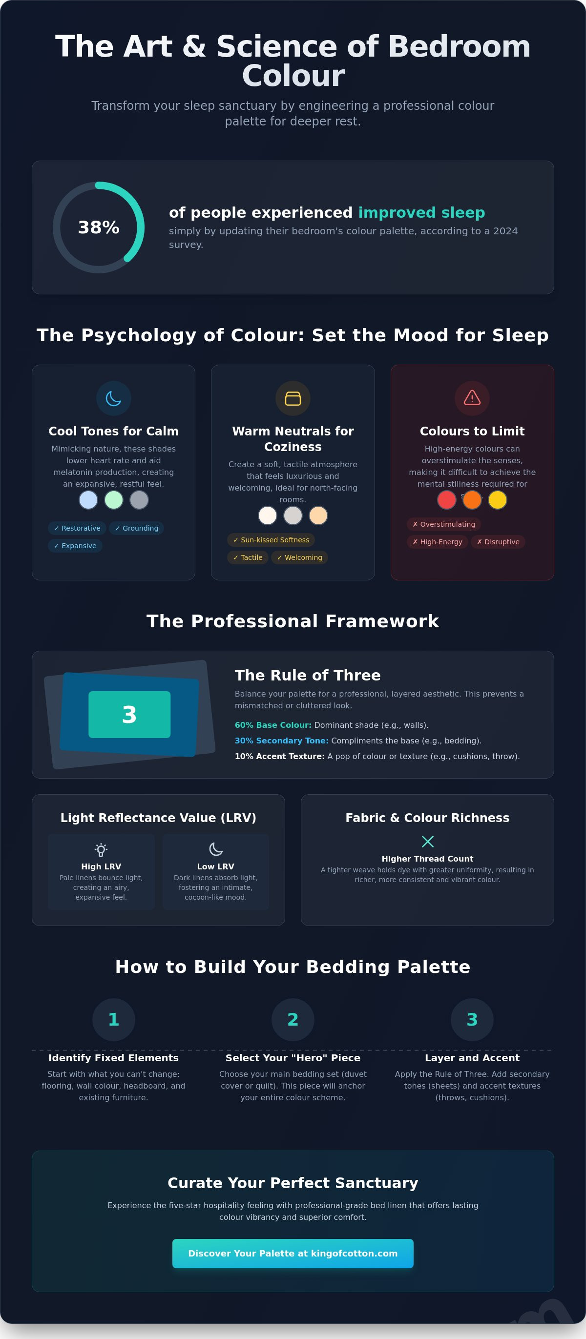
A 2024 survey revealed that 38% of respondents experienced improved sleep simply by updating their bedroom's palette. This suggests that learning how to choose bedding colour scheme is not merely a matter of aesthetics; it's a fundamental step in engineering a better night's rest. Many homeowners find themselves trapped between bold colours that feel too aggressive for sleep and all-white linens that can occasionally feel clinical or uninspired. You likely want a space that feels curated and professional, yet many bedrooms end up feeling mismatched or cluttered instead.
Mastering the art of bedroom styling requires a balance of luxury, mood, and material finish. We'll provide you with an expert framework to transform your sleep sanctuary into a refined retreat. You'll gain the confidence to mix sophisticated neutrals with moody accent tones while learning how to maintain the vibrancy of your high-quality linens. We'll explore how the interplay of light and textile finish creates a professional look that promises both elegance and deep rejuvenation.
Key Takeaways
- Understand the physiological impact of "cool" versus "warm" tones and how they serve as the visual foundation for superior sleep hygiene.
- Master the "Rule of Three" framework to balance base colours, secondary tones, and accent textures for a professional, layered aesthetic.
- Discover a step-by-step professional method for how to choose bedding colour scheme by identifying your room's fixed elements and selecting a definitive "Hero" piece.
- Explore the enduring "Hotel White" philosophy used by prestigious establishments to evoke trust, or learn when to embrace moody, contemporary palettes for a boudoir feel.
- Gain insights into selecting professional-grade bed linen that offers both the five-star hospitality experience and lasting colour vibrancy through superior craftsmanship.
The Psychology of Bedroom Colour: Setting the Mood for Sleep
A bedding colour scheme is much more than a decorative afterthought; it's the visual foundation of your sleep hygiene. It functions as a silent cue to your brain, signaling that the day's demands have ended and the time for restoration has begun. Professional designers treat the bed as the room's emotional anchor. By carefully selecting hues, you create a dedicated environment that actively encourages the transition into deep rest. This approach ensures your bedroom isn't just a place where you sleep, but a refined sanctuary designed for rejuvenation.
Our biological response to colour is rooted in how different wavelengths affect the nervous system. Understanding Color Theory Principles is essential when deciding how to choose bedding colour scheme for maximum comfort. Cool tones, such as soft blues and muted greens, are known to lower heart rates and blood pressure. This physiological shift facilitates the natural production of melatonin, the hormone responsible for regulating sleep cycles. Conversely, high-energy colours like vibrant reds or oranges can overstimulate the senses, making it difficult to achieve the mental stillness required for a peaceful night.
To better understand how specific colours can transform your space, watch this helpful video:
The world's most prestigious hospitality brands rely on specific palettes to guarantee universal comfort for their guests. They often default to crisp neutrals or serene cool tones because these colours are inclusive and calming. By mirroring these professional standards in your own home with high-quality bed linen, you achieve a "sanctuary effect." This is the feeling of immediate relief that occurs when you enter a space where every layer of colour and texture has been chosen with intent.
Cool Tones: Blue, Green, and Grey
Duck egg blue and sage green represent the gold standard for relaxation in modern bedroom design. These shades are restorative and grounding, mimicking the soothing qualities of the natural world. Cool tones have a unique architectural benefit; they visually recede from the eye. This creates an illusion of space, making smaller bedrooms feel more expansive and less cluttered. Grey remains a sophisticated neutral in this category, providing a steady, professional anchor that grounds lighter, more ethereal accents.
Warm Neutrals: Cream, Oatmeal, and Latte
Many homeowners are moving away from stark, clinical whites in favour of "warm minimalism." Shades like oatmeal, cream, and latte offer a cosier, more tactile atmosphere that feels inherently luxurious. These earthy palettes are particularly effective in north-facing rooms, where the natural light can feel cold or blue. By using warm neutrals, you introduce a sense of sun-kissed softness without the aggressive energy of bright yellows. These tones also highlight the material quality of your linens, emphasizing a refined and sustainable aesthetic.
The Professional Framework: Tones, Textures, and Light
Professional bedroom design transcends simple colour matching; it requires an understanding of how light and material density interact. One of the most overlooked technical factors is Light Reflectance Value (LRV). This metric determines how much light a colour reflects versus how much it absorbs. When you're deciding how to choose bedding colour scheme, the LRV of your linens will dictate the room's energy. High LRV shades, like crisp whites or pale ivories, bounce light around the room to create an airy, expansive feel. Conversely, deep navy or charcoal linens have a low LRV, absorbing light to foster an intimate, cocoon-like atmosphere that's perfect for late-night relaxation.
The density of the fabric also plays a critical role in colour presentation. Higher thread counts create a tighter, more compact surface that holds dye with greater uniformity. This results in a much richer and more consistent colour depth compared to lower-density fabrics. When Crafting the Perfect Palette, designers often consider how these dense fibres interact with the room's light sources. For a deeper technical exploration of how material choice impacts your sleep environment, you might find The Ultimate Guide to Buying Luxury Bed Linen particularly insightful.
How Weave Affects Colour Perception
The way a fabric is woven fundamentally changes how the eye perceives its hue. A sateen weave features a four-over-one structure that exposes more of the yarn's surface, creating a subtle, lustrous sheen. This finish amplifies colour vibrancy and produces luxurious highlights as the fabric drapes. In contrast, a percale weave uses a classic one-over-one pattern, resulting in a matte, breathable finish that makes colours appear more modern and understated. As a general rule: "A sateen weave reflects light to deepen a hue, while percale absorbs it for a crisp, architectural finish."
The Rule of Three for Bedding Layers
To achieve a balanced, professional look, designers apply the "Rule of Three" to bedding layers. This framework prevents the bed from feeling one-dimensional or visually cluttered. You can explore these proportions within our sophisticated bed linen collections to find your ideal match:
- The Base (60%): This is your primary anchor, usually consisting of the duvet cover and main pillowcases in a solid neutral or foundational tone.
- The Secondary (30%): Introduce a coordinating shade through flat sheets or secondary pillows to add visual depth without overwhelming the space.
- The Accent (10%): Finish the ensemble with a bed runner or throw in a high-contrast colour or a distinct, tactile texture for a final touch of elegance.
Hotel White vs. Contemporary Palettes: Finding Your Aesthetic
The decision of how to choose bedding colour scheme often begins with a fundamental choice: the timeless purity of "Hotel White" or the dramatic depth of contemporary palettes. In the world of professional hospitality, white is the absolute standard. It serves as a visual guarantee of cleanliness and meticulous care, fostering a sense of trust that is essential for a restful stay. Beyond hygiene, white creates a luminous atmosphere that feels expansive and serene. It's the ultimate designer's tool for making a bed look like a weightless cloud of comfort.
However, modern residential design frequently embraces more evocative, moody aesthetics. Deep tones like claret, ink, or charcoal can transform a bedroom into a sophisticated boudoir. These darker hues provide a sense of security and intimacy that lighter colours cannot replicate. When opting for these rich pigments, the quality of the textile is paramount. Investing in high-grade Egyptian cotton bedding is the most effective way to ensure colour longevity. The long-staple fibres absorb professional-grade dyes more deeply, preventing the premature fading that often plagues lower-quality linens.
The Case for All-White Bedding
All-white linens act as a versatile canvas, allowing you to update your room's look with seasonal accessories without replacing your core investment. For individuals managing high-stress lifestyles, a white bed offers a psychological "clean slate" at the end of each day. As noted in The Psychology of Colors, the absence of distracting patterns can significantly reduce mental clutter. You can prevent a white scheme from feeling clinical by layering different thread counts and textures, such as a crisp percale flat sheet paired with a soft, quilted white throw.
Mixing Solids and Subtle Patterns
If a monochromatic look feels too stark, subtle patterns offer a refined middle ground. Pinstripes or jacquard weaves introduce visual interest and colour without overwhelming the room's architecture. Tone-on-tone layering, such as pairing a light silver-grey duvet with charcoal pillowcases, is perhaps the simplest professional look to execute. It creates depth through contrast while maintaining a cohesive palette. White also serves as an excellent "cleanser" in these setups; a white top sheet can break up bold patterns, preventing the bed from feeling visually heavy. For a final touch, use bed runners to introduce seasonal pops of colour that can be swapped out as trends evolve.
A Step-by-Step Guide to Building Your Bedding Palette
Building a professional bedroom aesthetic requires a methodical approach that respects the architectural context of your home. When considering how to choose bedding colour scheme, you must first acknowledge the room's fixed elements. Your flooring, headboard, and wall colour are the permanent boundaries of your palette. A velvet headboard in a deep navy, for instance, demands a bedding scheme that either provides a sharp, clean contrast or sits within a complementary monochromatic range. By starting with these unchangeable features, you ensure that your new linens feel integrated rather than like an afterthought. This creates a silent dialogue between the bed and the room, establishing a sense of intentional design.
Once the environment is assessed, select your "Hero" piece. This is typically your duvet cover, as it occupies the largest visual surface area and sets the dominant tone. If you choose a deep charcoal hero, your "Supporting" tones, such as fitted and flat sheets, should provide a subtle transition. These secondary layers prevent the bed from looking like a monolithic block of colour. Finish the ensemble with "Texture Accents" like waffle-knit cushions or silk-blend throws. These smaller elements allow you to experiment with high-contrast colours or bold textures without committing to a full set of linens. Before finalizing your selection, ensure your dimensions are perfect by consulting The Definitive UK Bed Size Guide.
Step 1: Assessing Natural and Artificial Light
Light is the most volatile factor in interior design. It's essential to test fabric swatches at different times of the day, as morning sun and evening shadows will dramatically alter your perception of a hue. Warm LED lighting is a common trap; it can easily turn a sophisticated "cool grey" sheet into a "muddy beige". Always check your bedding colour against your bedroom wall paint under both natural daylight and your primary evening light source to avoid unexpected tonal shifts that can disrupt the room's serenity.
Step 2: Choosing Your Base Material
The foundation of any high-end palette is the quality of the fibre. Egyptian cotton remains the premier choice for professional designers because its long-staple fibres hold dye with exceptional clarity and maintain a lustrous finish over time. You should select from our luxury bedding collections based on your local climate and personal preference. A crisp percale is ideal for warmer environments or those who prefer a matte, modern look. Conversely, a silky sateen provides warmth and a light-reflecting sheen that adds luxury highlights to your chosen colours. This material-first approach allows you to create a "season-proof" palette that remains vibrant and elegant year-round.
To start curating your own professional sleep sanctuary, explore our range of sophisticated bed linen.
Curating Your Sanctuary with King of Cotton
King of Cotton brings the prestige of the world's finest five-star establishments directly into your residential bedroom. Choosing the right palette is the first step, but maintaining that aesthetic requires professional-grade materials. Our heritage as a global provider to the hospitality sector ensures that every piece of bed linen we offer meets international standards of excellence. When you understand how to choose bedding colour scheme, you're investing in a vision of comfort that should last for years. We use high-performance dyes that penetrate deep into the long-staple fibres, ensuring your chosen hues remain vibrant even after repeated laundering.
To preserve the depth of your chosen palette, proper laundry care is essential. We recommend washing your linens inside out at a moderate temperature. You should also avoid detergents containing optical brighteners, as these can subtly alter the intended tone of your coloured fabrics over time. This small adjustment in care ensures your sanctuary retains its serene confidence and professional look for the long term.
The Signature Collections
Our collections cater to both the "Hotel White" purist and the contemporary decorator. Our classic white Egyptian cotton ranges offer the crisp, clean foundation discussed earlier in this guide, while our coloured collections provide sophisticated alternatives for a more moody aesthetic. For those who value visual depth, our sateen ranges are the preferred choice. The unique weave creates a subtle shimmer that catches the light, adding a layer of luxury that a standard matte finish cannot provide. Buying from a supplier that services prestigious residential and commercial sectors globally gives you the confidence that your bedroom reflects a standard of quality found in the world's most exclusive accommodation.
Final Touches for the Complete Look
A truly professional design doesn't stop at the mattress edge. To create a seamless master suite flow, consider coordinating your bedding with our luxury bath towels in complementary tones. This creates a unified sensory experience throughout your private sanctuary. Additionally, our bespoke sizing options ensure a perfect, tailored drape that eliminates the cluttered look of ill-fitting sheets. Every detail, from the material density to the final finish, is crafted to provide an accessible upgrade to a more refined lifestyle. This holistic approach to design is what separates a standard bedroom from a world-class retreat.
Ready to transform your bedroom with a professional palette? Explore our full range of luxury bed linen to find the perfect foundation for your home.
Transform Your Bedroom Into a Professional Retreat
Your bedroom is more than a place for sleep; it's a personal sanctuary where design meets well-being. By mastering how to choose bedding colour scheme, you've gained the tools to balance the technical "Rule of Three" with the psychological impact of light and material finish. Whether you prefer the timeless purity of hotel white or the moody depth of contemporary tones, the foundation of your aesthetic remains the quality of the textile itself. High-thread-count Egyptian cotton provides the necessary density to hold vibrant pigments while offering the luxurious hand-feel that defines a five-star experience.
Since 1995, King of Cotton has served as a trusted expert in material craftsmanship. We've established ourselves as premier suppliers to the finest homes and hotels in the world by prioritizing durability and elegance. Our linens utilize professional-grade dyes that ensure your chosen palette retains its richness through years of use. It's time to apply these professional design principles to your own home and enjoy the rejuvenation that comes with a perfectly curated environment.
Upgrade your bedroom with our professional-grade Bed Linen Collections and experience the difference of heritage quality. Your journey to a more refined lifestyle begins with the very first layer.
Frequently Asked Questions
What is the most relaxing colour for a bedding colour scheme?
Blue is the gold standard for relaxation. A widely cited industry survey found that individuals in blue bedrooms sleep an average of 7 hours and 52 minutes per night. This specific wavelength of light is known to lower heart rates and blood pressure. By creating a tranquil environment, blue bedding facilitates the body's natural transition into a restorative state of deep sleep.
How many colours should I include in my bedding palette?
When considering how to choose bedding colour scheme, professional designers recommend a three-tone palette. This framework typically follows the "Rule of Three" which allocates 60% of the bed to a primary base, 30% to a secondary tone, and 10% to a textured accent. This specific ratio ensures your bed looks curated and intentional without becoming visually overwhelming or cluttered.
Does the thread count of my bedding affect the colour?
Thread count significantly impacts how a fabric holds and presents colour. High-density fabrics, such as our 400 or 600 thread count linens, feature a tighter weave that allows professional dyes to be absorbed with greater uniformity. This results in a much richer and more consistent colour depth. Lower thread count fabrics often appear less vibrant because the looser weave reflects light unevenly.
Can I mix different fabrics like linen and cotton in one colour scheme?
Mixing fabrics is a sophisticated way to add tactile depth to your bedroom. Pairing the crisp, lustrous finish of Egyptian cotton with the matte texture of a linen throw creates an elegant, layered look. This approach is vital when learning how to choose bedding colour scheme because it allows you to introduce visual interest and contrast through texture rather than relying on multiple competing hues.
How do I choose a bedding colour that goes with grey walls?
Grey walls provide a versatile neutral foundation that supports both monochromatic and high-contrast schemes. For a modern, professional look, choose charcoal or silver linens to create a sophisticated tonal gradient. If you prefer a more energetic contrast, navy or deep claret accents provide a striking visual anchor. Always consider your room's light levels, as cool greys can feel clinical without warm textile accents.
Should my pillowcases match my duvet cover or my sheets?
Your primary pillowcases should generally match the duvet cover to create a cohesive "Hero" unit at the head of the bed. Secondary pillows or "sham" cases often coordinate with the flat or fitted sheets to introduce a secondary tone. This layering technique follows the professional design framework of building depth. It ensures that the bed looks architecturally sound and inviting from every angle.
How do I stop my coloured bedding from fading over time?
Preventing fade begins with selecting linens treated with professional-grade dyes. Always wash your coloured bedding inside out at a moderate temperature of 40 degrees Celsius to protect the surface fibres. You must avoid detergents containing optical brighteners, as these chemical agents are designed for whites and will strip the vibrancy from darker pigments. This careful maintenance preserves the original depth of your palette for years.
Is white bedding hard to keep clean in a busy household?
High-quality white bedding is surprisingly practical because it can withstand higher laundering temperatures and oxygen-based brightening agents. Unlike coloured linens, white fabrics don't suffer from dye fade or tonal shifts over time. This durability makes them an enduring favourite for households seeking a five-star hotel aesthetic. Investing in professional-grade Egyptian cotton ensures that your white linens remain crisp, bright, and exceptionally soft through frequent use.